Wednesday, 31 October 2018

Orange Shot-by-Shot Analysis


!!SPOILERS ABOUT THE ANIME ORANGE AHEAD!!

Orange - Kakeru's Death Original World Line

Credit to Telecom Animation Film


Shot 1 - Medium Shot (Debatably a Long Shot)
Why is it a Medium Shot (MS)?

Head is visible 
Feet cannot be seen
Waist can be seen

In this opening Medium Shot we can clearly see that there is only one character (Kakeru) and he appears to have dropped something that seems to be a cellphone. Based on the way the room looks, I would say that it is either his room or his Mother's room whom has already passed on. The fact that he is looking through packed boxes in a closet suggests that he is perhaps looking back on past memories of his or his Mother's. Also, seeing that the particular object that fell was a cellphone draws the audiences attention to the object and allows us to infer that this cellphone will have some significance later on in the scene.  


Shot 2 - Medium Close Up (Debatably a Medium Shot)
Why is it a Medium Close Up (MCU)?

Head is visible
The waist can be seen
The top of the shoulders are visible


In this Medium Close Up Shot we can see Kakeru's reaction to the fact that his Mother had actually written a response to his message when he said he wouldn't go to the hospital, it was just that she never sent it. The shock on his face, is most likely because he must have previously thought that she never read the message and if she did she probably ignored him. We can also see how eager he is to read what it says, shown by how close he puts the phone to his face with his head down and his use of two hands. This not only interests the audience but also causes them to want to discover the words Kakeru's Mother couldn't say and why she didn't send them.


Shot 3 - Close Up (CU)
Why is it a Close Up (CU)?

Characters face can be seen
Top of the shoulders can be seen
A little bit of background can be seen

In this close up shot we can see that Kakeru has now finally come to the realisation that his Mother wasn't selfish, everything she did was for his sake. Judging by the look in his eyes and the fact that he is crying we can tell that he is feeling some regret about how he treated his Mother and why he wasn't able to understand that all the things she did were for him. This causes the audience to feel sympathy towards Kakeru as he sometimes treated his Mother as an annoyance even on the last day of her life and so he never actually had the chance to apologise to her even upon finding the truth.


Camera Angle 1 - High Angle 

This High Camera Angle allows us to see that when Kakeru was younger and his Mother was still alive they were still having their fair share of hardships. The camera angle makes them look small and weak which greatly supports the fact that Kakeru's father was abusive as they weren't strong enough to physically fight back. In addition we can see that as Kakeru was so young he was not fully aware of the situation, this most likely caused him to believe that his Mother was the 'antagonist' and his Father was the 'victim'. The fact that he is holding on to his Mother like that suggests that he might want something, in this situation we can assume that this was for his Mother not to divorce his Father who he loved.


Camera Angle 2 - Low Angle

This Low Camera Angle shows how Kakeru has changed over the years, rather than clinging to his Mother looking vulnerable he looks stronger and much more capable. The fact that he is looking down at his Mother shows that at that time he no longer respects her anymore/has lost faith in her. Despite this the look on his face says differently, this probably that although he keeps up this act of hating her and seeing her as an annoyance he still has a little hope in her. In truth, Kakeru knows the way he is treating her is wrong but he is also unable to forgive her because at the time he did not know the reality of the situation. I think that the audience is able to tell that in Kakeru's heart he always believed in his Mother and will always regret the way he treated her and the words he was unable to say. 


Analyse the camera movement at two key points in the clip and write about why the director chose to use that camera movement.


Camera Movement 1
Over-the-Shoulder Shot

At this point of the clip, the camera movement is quite slow, this is to allow the audience to have a longer time to process what actually happened that caused Kakeru's Mother to be so controlling of him. Had the scene have been too short, a large number of questions would have been left answered which is another reason why the slow camera movement worked very well for this point of the scene. It was easier to understand with slower shots and a normal paced speaking narrator.


Camera Movement 2
Extreme Close Up

From the point where Kakeru leaves his home, the speed of which the camera movement passed increased considerably from before. This is to show the rate at which he wants to 'repent for what he's done'. Another effect that it has is that the audience will also be feeling the tension rise and hoping that he's saved somehow which unfortunately isn't the case. The change of the camera movement from slow to fast also lets the audience know the heaviness of this situation. 


Sunday, 28 October 2018

Minority Report Shot-by-Shot Analysis

Shot 1 - Medium Close Up (MCU)

Why is it a Medium Close Up (MCU)?

Top of shoulders are visible
Waist is not visible
Head is visible

This Medium Close Up (MCU) allows us to see a few of the people that are chasing the main character which gives the audience a rough idea of what he's up against. Although we can't see all of the characters it is clear to see that the protagonist is outnumbered which causes the audience to lose hope and assume that he will be caught which will surprise them for what's to come. In the shot we can see that all the actors in this scene are wearing the same thing so we can infer that this is a uniform that they are most likely wearing for work. Their hats are quite similar to those we would see being worn by members of the army, this shows us that their jobs could have something to do with hostility. In addition the way they are positioned in this shot makes it seem as though the man at the front is the leader of them as the rest are just standing behind him and don't seem to play any important part in this scene. The fact that there are quite a number of them might make the audience feel intimidated.


Shot 2 - Establishing Shot (ES)

Why is it an Establishing Shot (ES)?

Can tell the characters position
Can't see the facial expressions of the characters
Can clearly see the setting

This Establishing Shot (ES) allows us to become familiar with the setting of which this scene is currently taking place. The current location appears to be quite deserted apart from the characters in the shot, this might be because they don't want to show what they're doing to the public and would rather carry out their task in private. The use of the car in the shot could imply that this scene might include someone trying to run/get away and will probably successfully due so as a car is very fast, this could be symbolism of some sort. Also, it looks as though one of the characters in the shot are running, this suggests some kind of action that might be developing in the scene.


Shot 3 - Close Up (CU)

Why is it a Close Up (CU)?

Can see the characters face
The whole top of the shoulders can be seen
A little bit of background can be seen

This Close Up (CU) allows us to clearly see the face of the character in the shot and understand what he's feeling/what is going through his head. Looking at his eyes, I can tell he is looking at someone and is most likely considering whether or not he is about to do something, most likely to be run away. His mouth seems to be making a smirk which supports the point that he might be planning to run and is probably confident that if he does so he will get away. In addition, the shadow covering the other side of his face could possibly suggest he's either turning into a bad guy or he's about to make a bad decision.


Why does the pace of the editing change in this sequence and what is the effect on the audience?

The pace of editing changes in this sequence to clearly show the contrast between the somewhat calm beginning compared to the large amount of action towards the end of the clip. This causes the audience to almost feel the change in the scene along with the editing and so it flows well and looks much better to the audience. This is because if we were to be watching an action filled scene with slow editing, it would be boring and lose the excitement that you'd to feel.

A Reminder of Camera Shots and Angles

Camera Shots:

Establishing Shot (ES)/Wide Shot (WS):
Shows you where the scene is going to be set, characters appear to be small but you can tell their position.


Long Shot (LS):
Shows the character from head to toe and can see a bit of background.


Medium Shot (MS):
Shows the character from head to waist.


Medium Close Up (MCU):
Shows the character from head to the top of their shoulders.


Over the Shoulder (OTS):
Usually used to show 2 characters speaking. The back of the head of on character is seen near the corner and on the opposite is the other character so it feels as though you are there.


Close Up (CU):
Shows the face of the character


Extreme Close Up:
Focuses on one key feature very closely for example a zoom on the eye.


Camera Angles:
(As seen on official Media blog)


High Angle:
Makes subject look small and weak.


Low Angle: 
Makes subject look big and powerful.


Unusual Perspective:
Can be used to surprise the audience or show danger (e.g. looking down off a cliff)


Note: Sometimes the image might not be accurate and so it could be for example in between a medium shot and a medium close up. If you pick either one in an exam you won't get it wrong so long as you explain your reasoning behind your selection. Make sure to memorise these. 

Thursday, 11 October 2018

Camerawork: Photo Storyboard


Establishing Shot (ES):
(Wide Shot)


This shot gives the audience an idea of the setting and where this storyboard will take place, in this case it is the fire escape stairs of a school. This also suggests that the characters within this storyboard are either students or teachers.


Over-the-shoulder (OTS):


This shot introduces the characters to the audience and suggests the relationship between the 2 characters. In this shot we can see that the characters are having a conversation between them, by the hand gestures we can infer that this could be an argument or they are trying to explain something in order to settle something.


Medium Shot (MS):


This shot shows that this discussion/argument is being continued and has now shifted to a different location - by the edge of the fire escape which could suggest danger. The 'X' above them also suggests that their opinions are clashing and that there is no understanding between them hence the circle in the middle.


Long Shot (LS): 


This shot shows that the interactions between these 2 characters has escalated and one of them is now carrying out the act of pushing the other off the fire escape. The sudden shift in the atmosphere would most likely cause the reader to feel some kind of shock.


Close-Up (CU):


This shot makes it clear to the audience that this character did not survive the fall and that he was pushed off rather than jumping off himself.


Extreme Close-Up (XCU):


This shot just further confirms the fact that this character was killed and fills the audience with fear and shock.


Medium Close-Up (MCU):


The fact that the character's clothes aren't straight also suggests he is dead as usually you would fix this. In addition, another characters foot can be seen in the image, this creates tension for the audience as we don't know who this character is and what they will do upon stealing the body.


Unusual Perspective: 


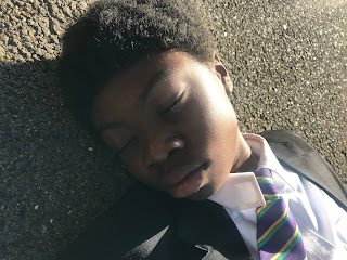
This camera angle allows us to see both of the characters from above to allow us, the audience to clearly see what is currently happening. Here we can see that the boy actor is dead and the girl is now coming to terms with what she has done.


High Angle: 


This camera angle makes it seem as though he is weak which represents the fact that he is dead.


Low Angle: 


This camera angle gives us greater understanding of what is happening within this scene.

Monday, 8 October 2018

Mise-en-scéne Stranger Things Analysis


        - Selected Aspects


Aspects of Mise-en-scéne (CLAMPS)


  • Costume
  • Lighting
  • Actions/Actor
  • Make-Up 
  • Props
  • Setting
Denotation - Costume:
At the beginning of the clip I could see: a man wearing a lab coat


Connotation - Costume:
A lab coat is usually associated with Science and/or experiments and so we are able to infer as the audience that his occupation is a Scientist. If we were to expand on this we could say that he is doing experiments due to the clothing he is wearing.


Denotation - Lighting:
In this clip I could see; flickering lights; flickering lights when the man was in the elevator; darkness as the elevator doors closed

Connotation - Lighting:
The flickering lights at the start create an eerie atmosphere which causes the audience to anticipate something to happen. This keeps the audience on their toes and will make them prepared for any jump scares or sudden actions that might be coming up. Additionally, it will keep them engaged and might make them think, 'I won't get scared', this kind of mindset allows you to pay attention to the little details that might be hints to jump scares and in turn allows the audience to thoroughly understand the episode. The use of the flickering lights when the man was in the elevator just added to the tension and made the audience to expect something to come out. This drives the attention away from above the man where the 'thing' actually is and causes both the audience and man to think that their safe when in reality he's in a whole lot more danger. The use of darkness after hearing the man scream and get lifted up makes the audience think that something horrible has happened to him and that a chapter has ended for him as you can also associate black with darkness.

Denotation - Actions:
In this clip I can see; a man with a lab coat running out of a room; a man with a lab coat continuously pressing elevator buttons; a growling sound; a man get lifted up and screaming;

Connotation - Actions:
The fact that this man is wearing a lab coat suggests that he could be a scientist and the location is his lab so he's most likely carrying out an experiment. However, the fact that he is running away in such fear while looking behind him could mean that one (?) of his experiments has gone terribly wrong and is possibly putting his very life at danger at this point. When he was continuously pressing the buttons of the elevator I think it allowed the audience to know that whatever/whoever it was that was chasing him, it was fast and the man had to get away desperately. The growling sound causes the audience to question and think, 'what is that?' which makes the shocking realisation that it's above even more impactful. The fact that he is a grown man and was lifted that easily suggests that whatever/whoever it is, is in fact quite strong which just makes it more dangerous. 

Denotation - Props:
In the clip I could see; bikes: the board game Dungeons and Dragons.

Connotation - Props:
I think that the use of bikes in the clip, shows that they are still quite young as having a bike is quite common at that age. Also the fact that they take them around with them a lot implies they are special to them. This leaves a greater effect on the audience because Will left his bike as he was running away from the monster. This further shows that the thing/person was very dangerous. The use of the board game Dungeons and Dragons shows the kind of things that the children enjoy and allows us, the audience to understand the characters more.

Denotation - Setting:
In the clip I could hear crickets chirping; I could see a man wearing a lab coat.

Connotation - Setting:
At the beginning, we can tell that the setting is either really calm or deserted, this is shown by the sound of crickets chirping which is usually quite faint. This implies that it is very quiet and maybe everyone who is supposed to be there has disappeared. The fact that there is a man wearing a lab coat makes the audience aware now that the setting is a lab, which could also mean that there are experiments going on. However, for a lab, it is quite strange to only see on person there and for it to be so quiet.


Thursday, 4 October 2018

Blog Feedback and Learner Response


WWW: This is a glorious start to GCSE Media – what a wonderful blog! I think it’s great that you’ve customised the look and – most importantly – the work is showing huge potential too. I completely agree with your intention of aiming for a 7-9 grade and let’s go for the top! It’s difficult to pick out a particular piece because you’re offering excellent depth and detail across the blog – from your opening questions that offer engagement and thoughtful responses to your WaterAid analysis which is extensive. Keep up the good work!

EBI: A minor criticism: we need to be adding the depth and detail you offer for the WaterAid advert for the Heinz advert. You’ve perhaps chosen a tricky advert to offer in-depth analysis but you could write about how well established the Heinz brand is and the instantly recognisable colour scheme. Always remember to explore texts from a variety of angles and offer extended paragraphs in your written analysis!

LR: Reflect on your first month of Media. What do you feel is your strongest piece of work so far? What is your weakest? What specific skills or knowledge do you need to develop over the rest of the course? How can you improve the depth and detail of your media analysis?

My first month of Media has actually been really enjoyable and interesting. I find the idea of doing homework in the form of blogs makes it seem like less of a task and more of a fun thing to do. Using technology makes it much easier and quicker to complete as I am more used to it than writing. This makes me feel like I can express myself more using blogs which is part of the reason why I used a picture I took as the background for my blog. 

I feel that my strongest piece in Media is my WaterAid analysis because I was able to go into a lot of detail and pick out little parts of the the image and analyse them as much as I could. 

I think that my weakest blog in Media is either my Heinz Advert Analysis or the 10 questions. The reason that I think this is because for the Heinz Advert Analysis I could have further analysed it but I found this quite difficult due to it being quite a plain advert with not much going on. I also think that for the 10 questions I could have spoken about CLAMPS (Costume, Lighting, Actors/Actions, Make-Up, Props and Setting) to improve my explanation and make it more high level.

I need to develop my ability to look deeper into the text/image in order to make my analysis longer and more impactful. I can improve the depth and detail of my media analysis by expanding on what I've said further and turning it into a more advanced work that will make me feel proud once I've finished it.

Wednesday, 3 October 2018

Heinz Advert Analysis: Denotation and Connotation


Denotation:
In this advert I can see a Heinz Beanz can on a plain turquoise background and what seems to be a bean stalk wrapped around it. I can also see the words, 'for truly magic beans'. 

Connotation: 
The use of the bean stalk and the words, ' for truly magic beans' are a reference to the Fairy Tale 'Jack and the Bean Stalk' which will appeal to the younger audience. By aiming this particular advert at children will in turn cause parents to start taking in interest in buying it for their children which will increase the profit made. The use of the plain turquoise background makes for a simplistic design and yet it also captures the eye and allows for a memorable advert & slogan. I also think that the slogan used here will make children think that they can grow their own bean stalk like in the Fairy Tale and it also shows that Heinz themselves think that the beans they produce are magical/special. The colours on their own are quite distinct as well, which means that it would be easy to pick them out from other competitors on the shelf.